BarryWeber.com

Websites Designed
Specifically for
Phone and Tablet
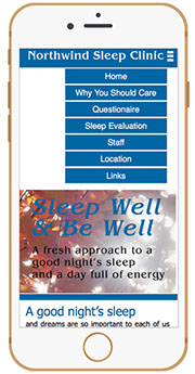
- Accordian Style Menu Pulls down from top Menu Bar
- Easily read and select all menu options
- Touch-Centric interface
- Mobile Devices are automatically detected.
- The design is chosen to match the device dimensions.
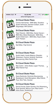
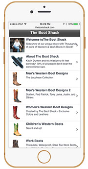
App-Like Interface
- Select Menu Options just like they were part of a mobile application designed specifically for phone or tablet
- Easily read text optimized for the display size of each device

Advanced Parallax
Scroll Motion
- Pages pop on the screen when scrolled flipping over previous pages.
- Advanced Interface that brings site visitors back time and time again to the website
- Click on each phone to view the phone specific website design
- All links on this page will go to phone specific designs
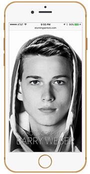
Commercial • Senior • Product Photography
320-492-3210